

Curvo / Tipografia
Curvo és una tipografia sans serif d’alt contrast, amb línies diagonals i corbes pronunciades, que destaca per l’estil elegant i detallat. El disseny de la “o” i la “H” reflecteix el caràcter propi de Curvo, amb un contrast de gruix des de Thin fins a Bold. Aquesta tipografia ofereix dues terminacions diferents: una recta amb inclinació diagonal, i una altra amb extrems corbats que recorden les serif, tot mantenint la personalitat sans serif.
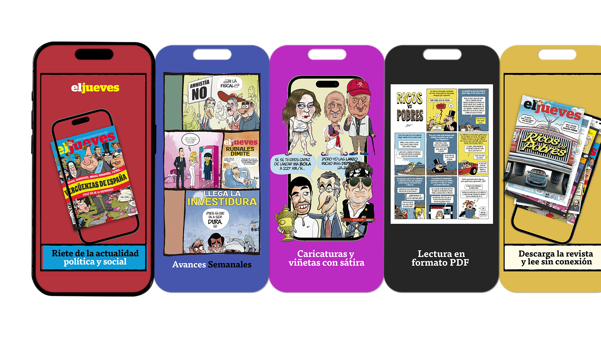
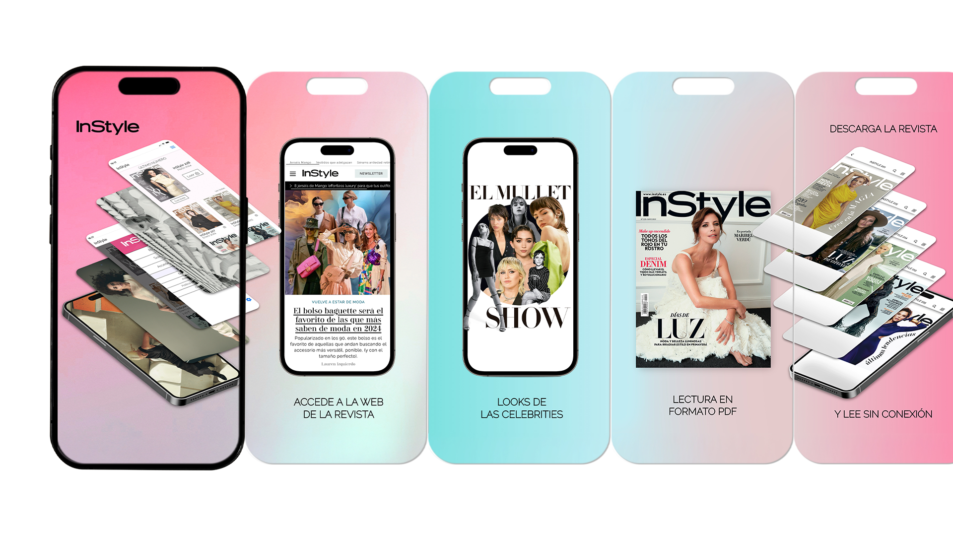
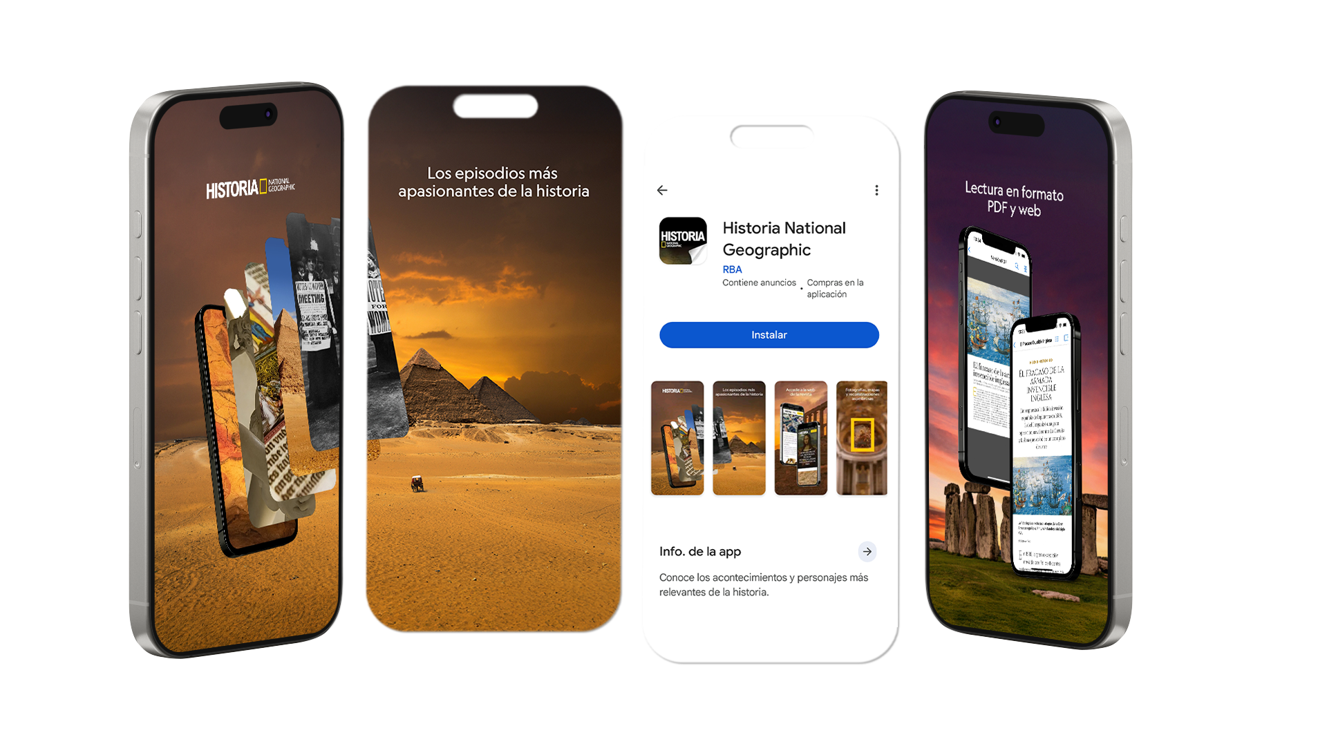

Apps Previews RBA per Android i Apple / Disseny UX/UI
RBA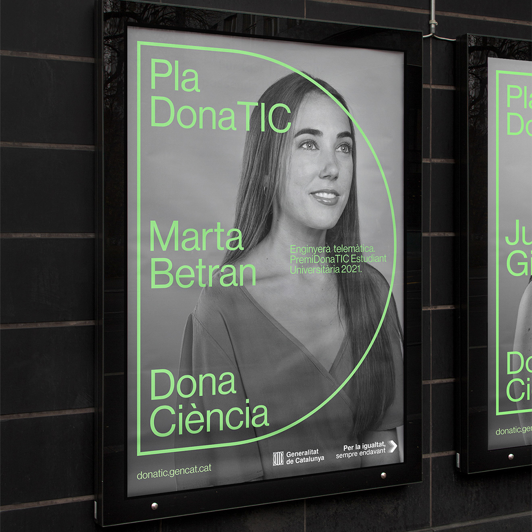
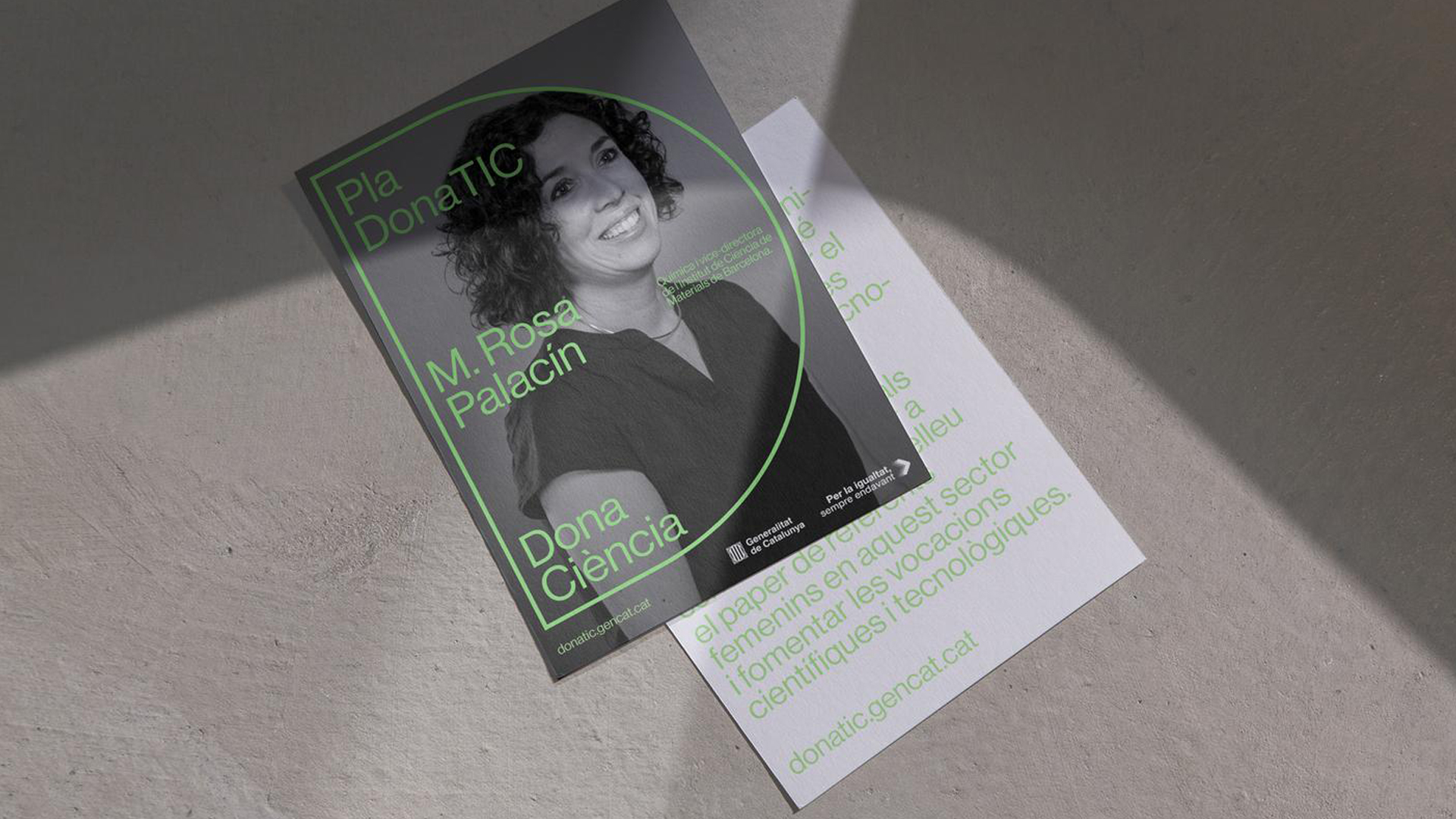
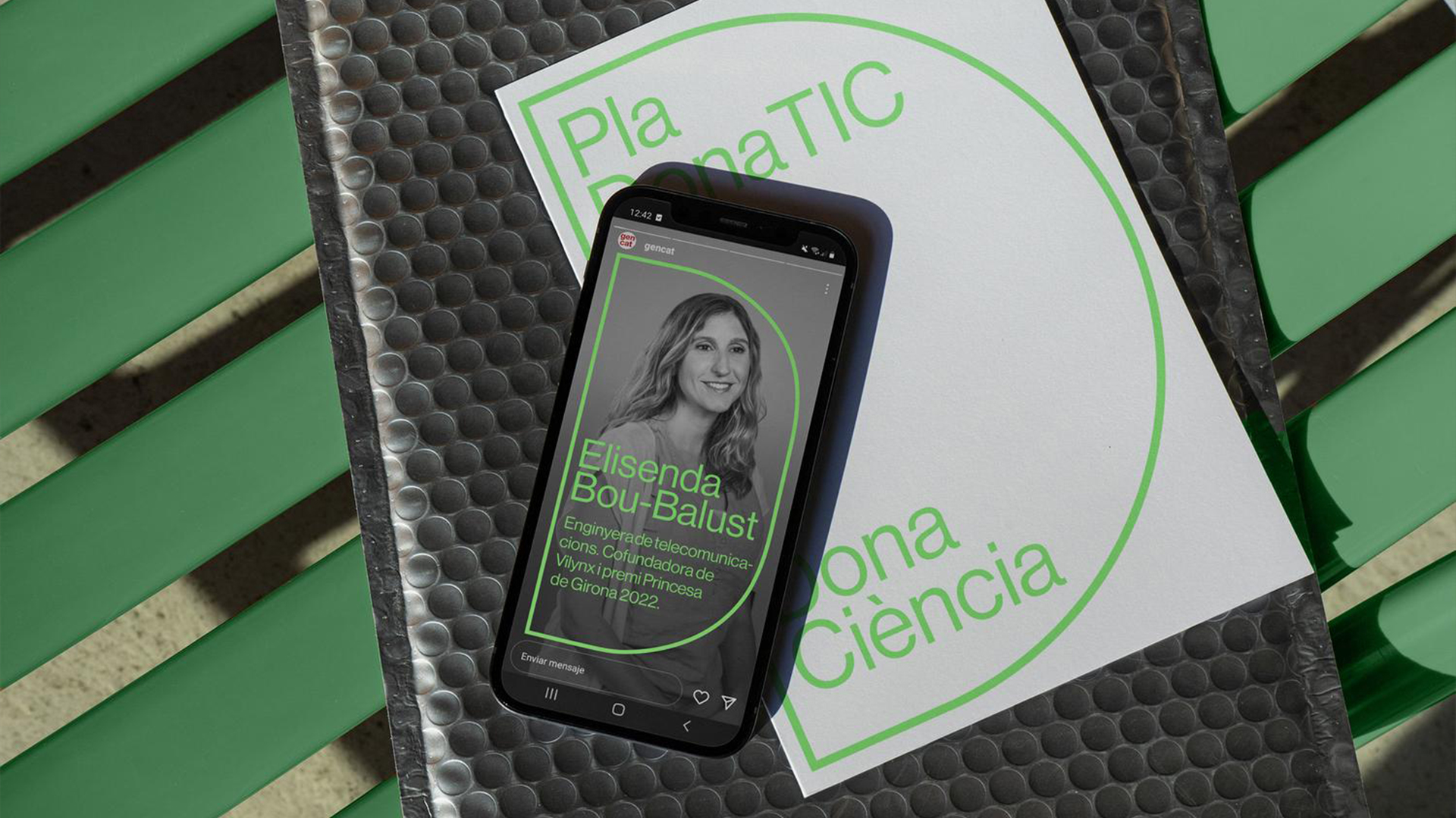
Dones TIC / Campanya Gràfica
Campanya gràfica i vídeo per als Premis Dones TIC. Uns premis per destacar el paper fonamental de les dones en el món professional, empresarial i acadèmic de les noves tecnologies
Evil Love
National Geographic / Disseny UX/UI
Direcció d'art, disseny gràfic i elecció de fotografia per a campanyes digitals a tot el món per a National Geographic, Viajes i Historia. Cada campanya està basada i dissenyada pensant en National Identity i la seva àmplia gamma de fotografies.
RBA


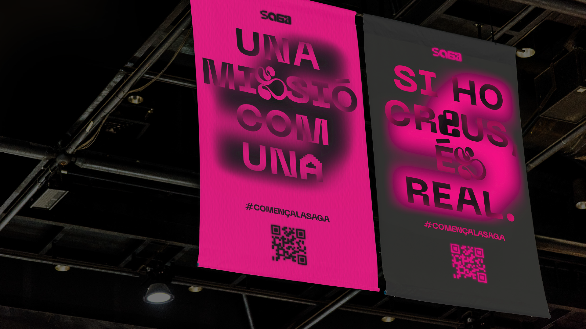
Saga 2023 / Campanya i Identitat
Després de desenvolupar la identitat de SAGA, vam dissenyar la nova campanya del 2023. Pensant en els conceptes: la religió dels videojocs i "descobrir un món nou", van néixer dos pòsters de disseny, un seguint la identitat de Saga dissenyada anteriorment, l'altre amb un gràfic místic totalment diferent.
Evil Love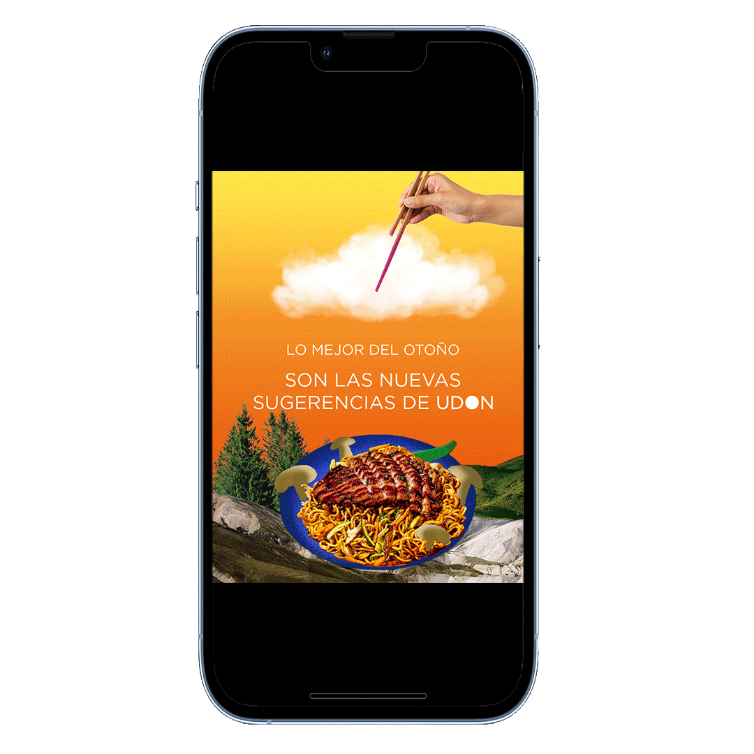
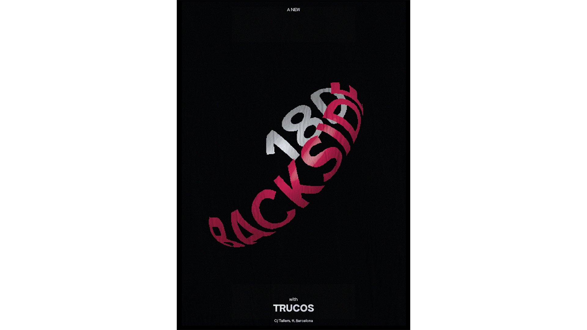
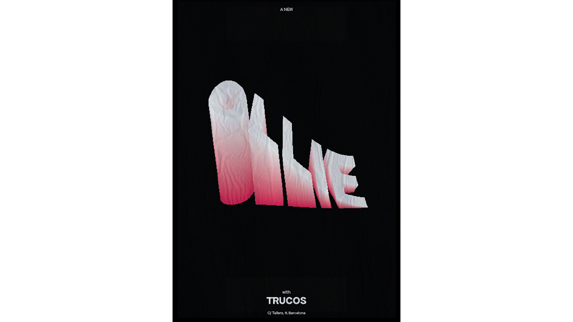
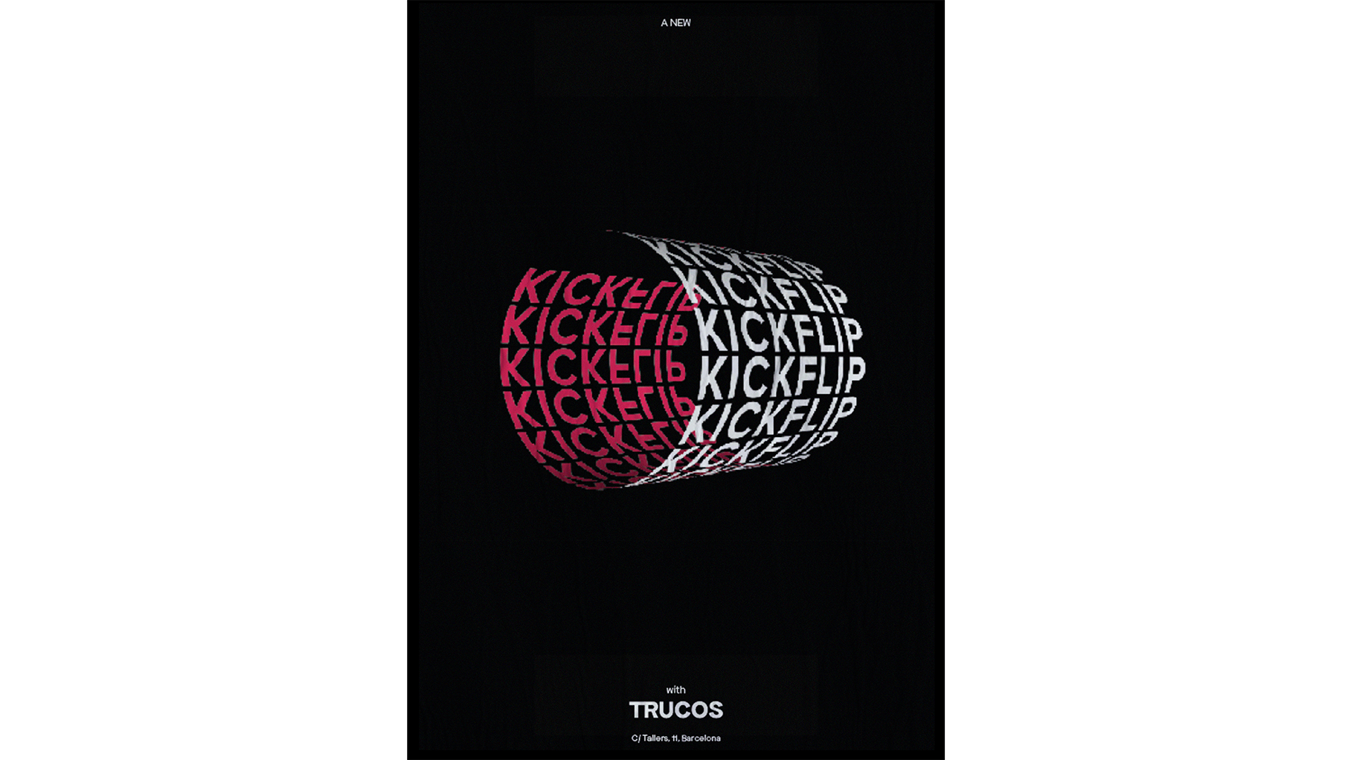
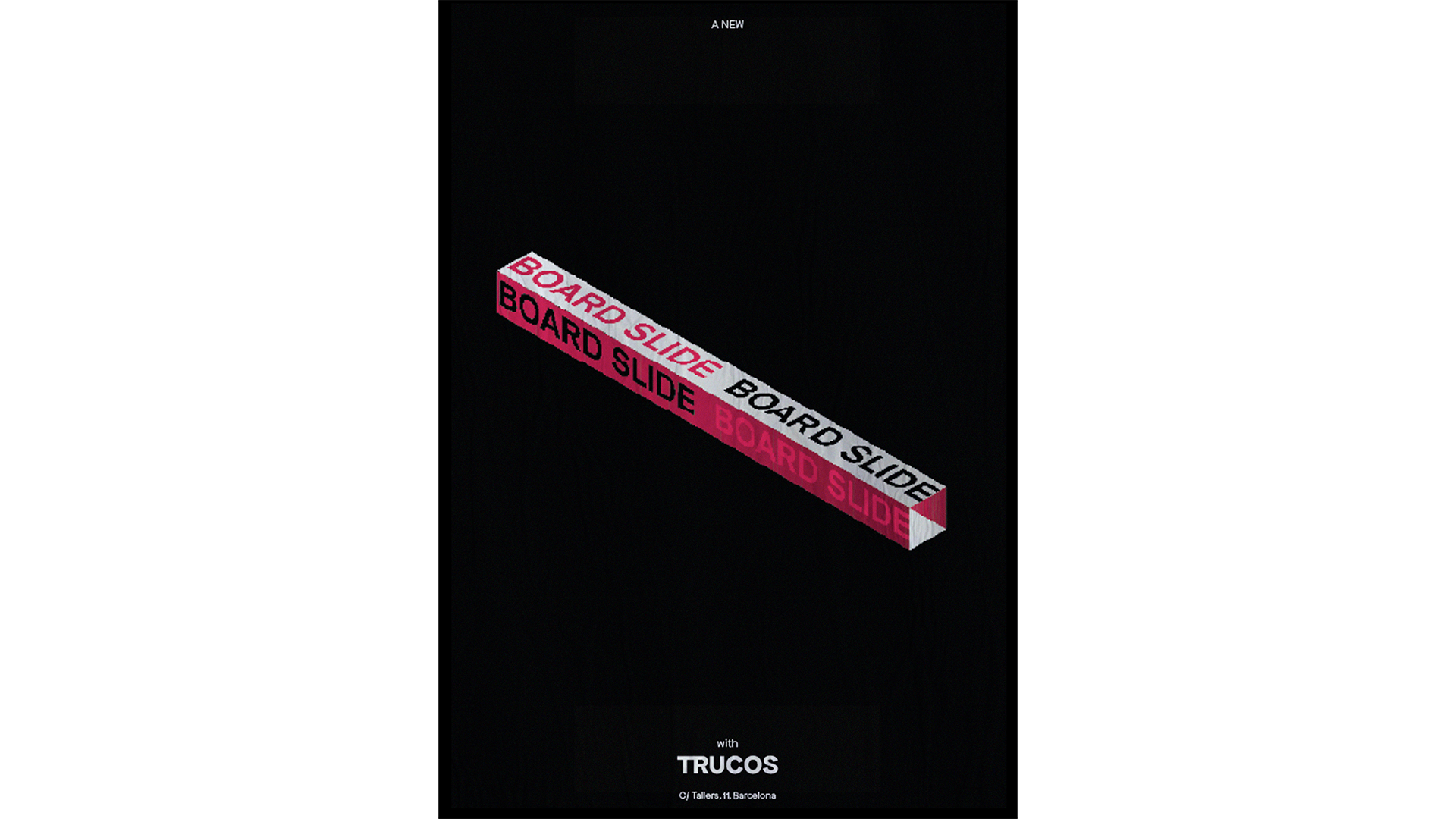
Saga 2023 / Campanya, Identitat i typografia
Identitat gràfica per a Trucos, una nova botiga de patins al Raval, que combina el truc del nom amb el seu moviment, creant pòsters tipogràfics. Posteriorment, skaters professionals van ser fotografiats realitzant el mateix moviment del pòster.
Evil Love


Saga 2022 / Campanya i Identitat
Plataforma per la Llengua volia fer el seu primer festival de videojocs català. Així va néixer SAGA, el Saló del Gaming. Per a la seva primera campanya volíem demostrar que els videojocs creen per si mateixos una aura de misticisme i de grup "religiós", sigui qui sigui el que hi jugui.Disseny, Campanya i logotip tipogràfic: Iraida Serlavós / Copy: Anna LLopis - Director d’art: Jose Parralejo
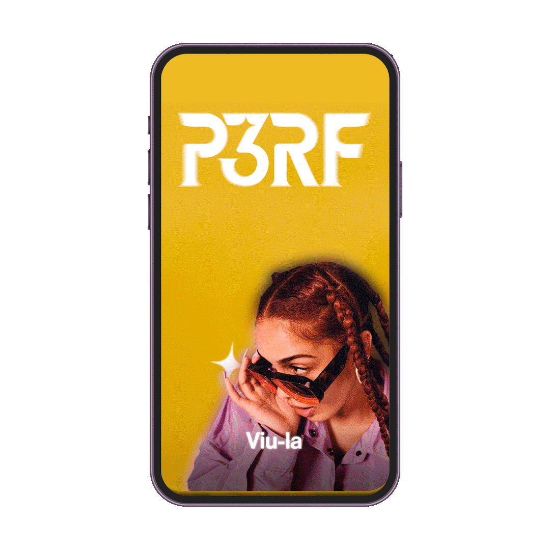
PERF / Identitat, Disseny UX/UI
Una proposta per a la Marca Jove CCMA. Amb una aura eclèctica i brillant, és una demostració de la visió real d'uns joves que s'adapten perfectament a qualsevol pla, perquè només volem gaudir tant com puguem.
Evil Love. Naming: Marc Vidal.
Evil Love. Naming: Marc Vidal.
UDON / Campanya, Disseny UX/UI
Campanyes comercials digitals per a Udon que segueixen tot l'imaginari creat anteriorment i el concepte d'#orientalment.
Evil Love
Evil Love

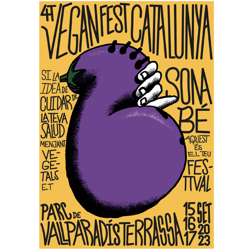

Vegan Fest / Campanya, Tipografia, Lettering
Pel Vegan Fest 2023, la nova campanya reflecteix la idea d'aprofitar les verdures per crear-hi instruments musicals. Un concepte esbojarrat, però completament indiferent.
Evil Love
Vegan Fest / Campanya, Tipografia, Lettering
Pel Vegan Fest 2023, la nova campanya reflecteix la idea d'aprofitar les verdures per crear-hi instruments musicals. Un concepte esbojarrat, però completament indiferent.
Evil Love
Pel Vegan Fest 2023, la nova campanya reflecteix la idea d'aprofitar les verdures per crear-hi instruments musicals. Un concepte esbojarrat, però completament indiferent.
Evil Love
![]()
![]()
![]()
![]()
![]()
![]()
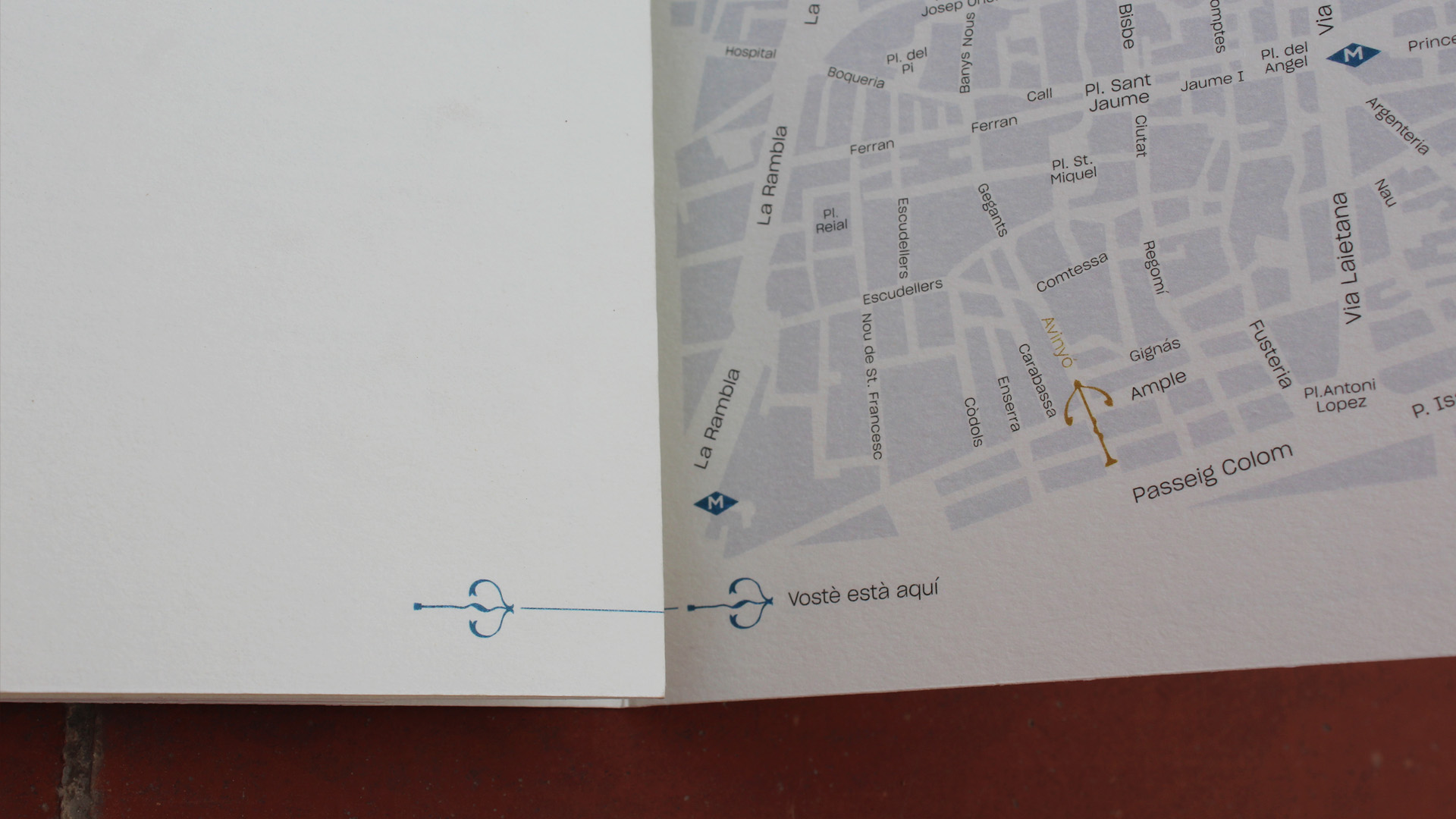
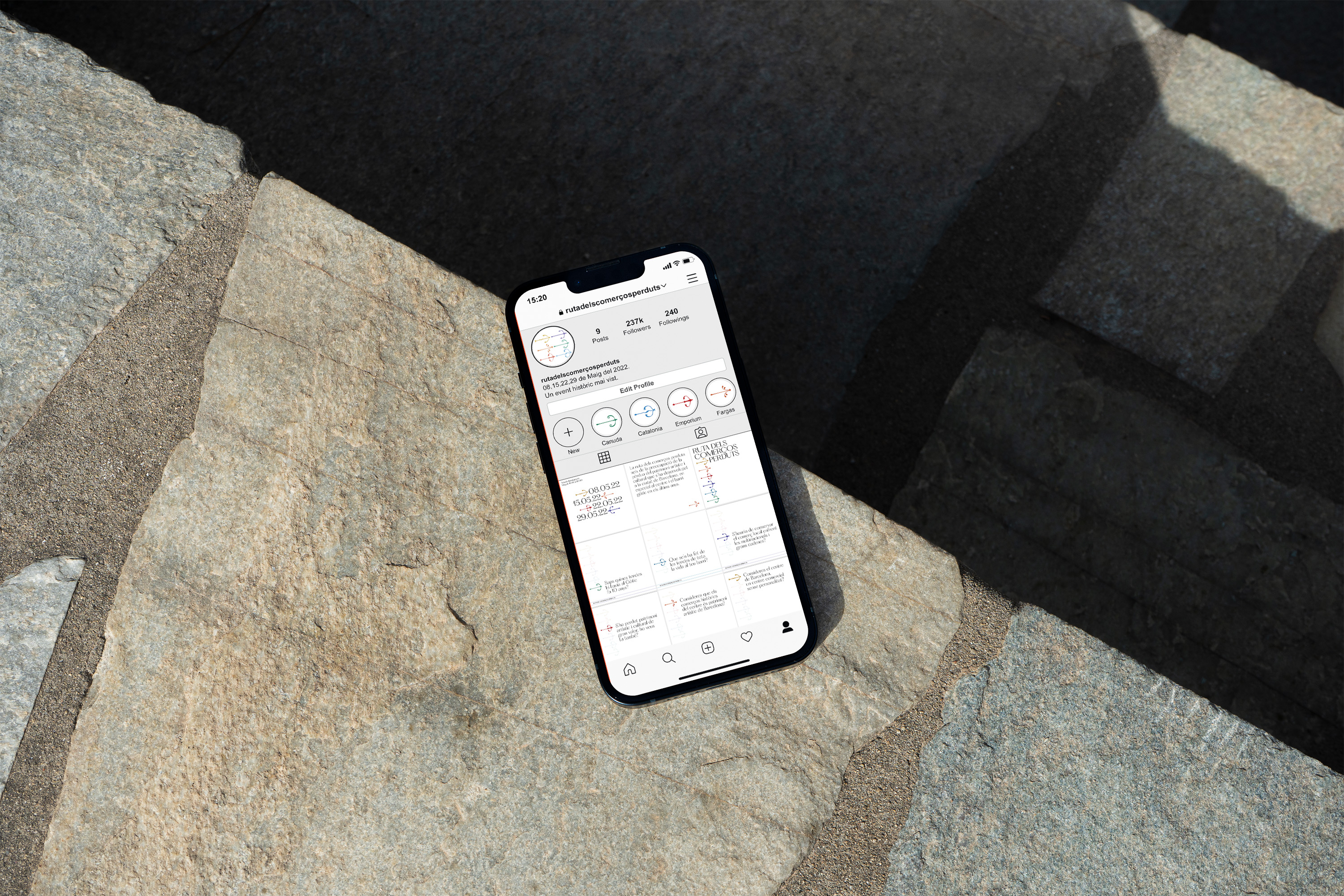
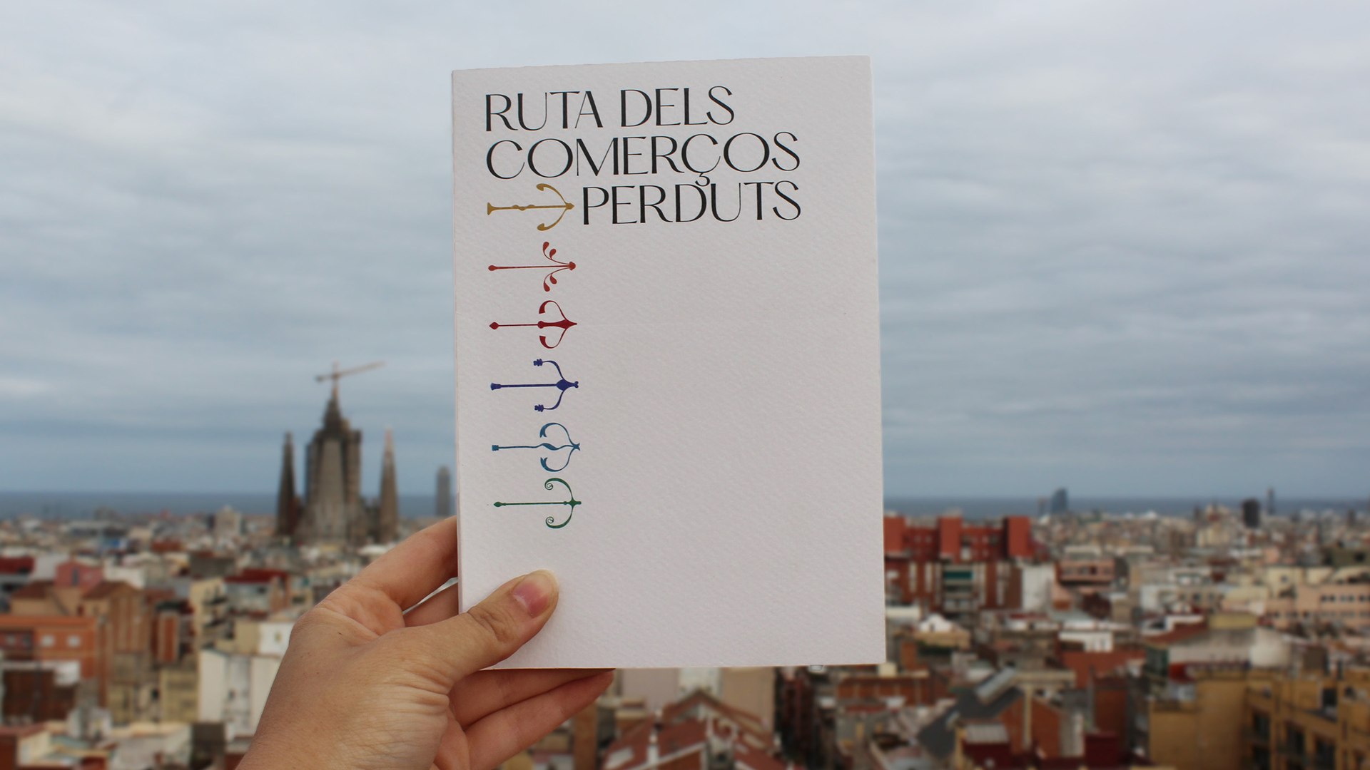
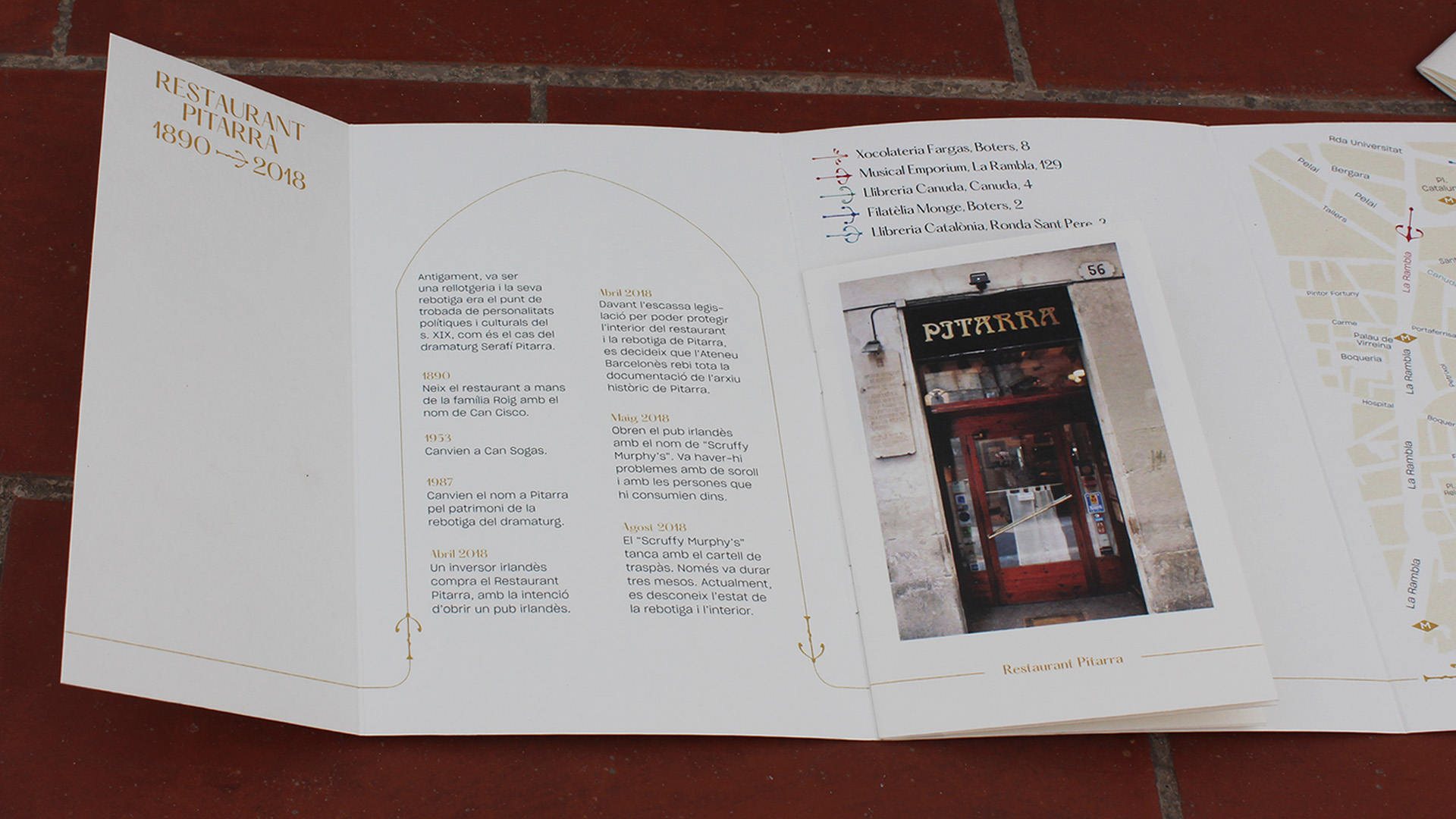
Ruta dels comerços perduts / Campanya i Identitat
La Ruta dels comerços perduts és una ruta fictícia per la pèrdua d'oficis típics al gòtic a causa de l'especulació immobiliària. La seva identitat prové de sis files dibuixades per a cada ofici, a través de cada disseny d'interiors. Es van crear diferents suports per visitar correctament la ruta fictícia.


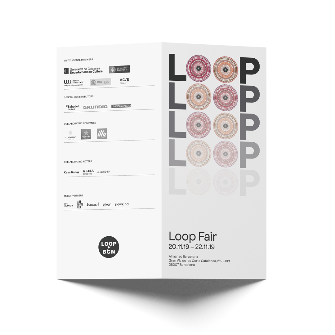

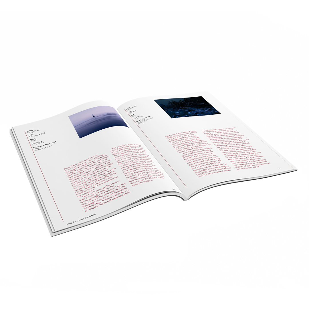

Loop BCN / Campanya i Identitat
Es va dissenyar una icona per representar un vídeo de càmera utilitzant els símbols "reproducció" i "aturada". A partir d'aquesta icona es va dissenyar una campanya gràfica, incloent-la a les peces de disseny gràfic.
![]()
![]()
![]()
![]()
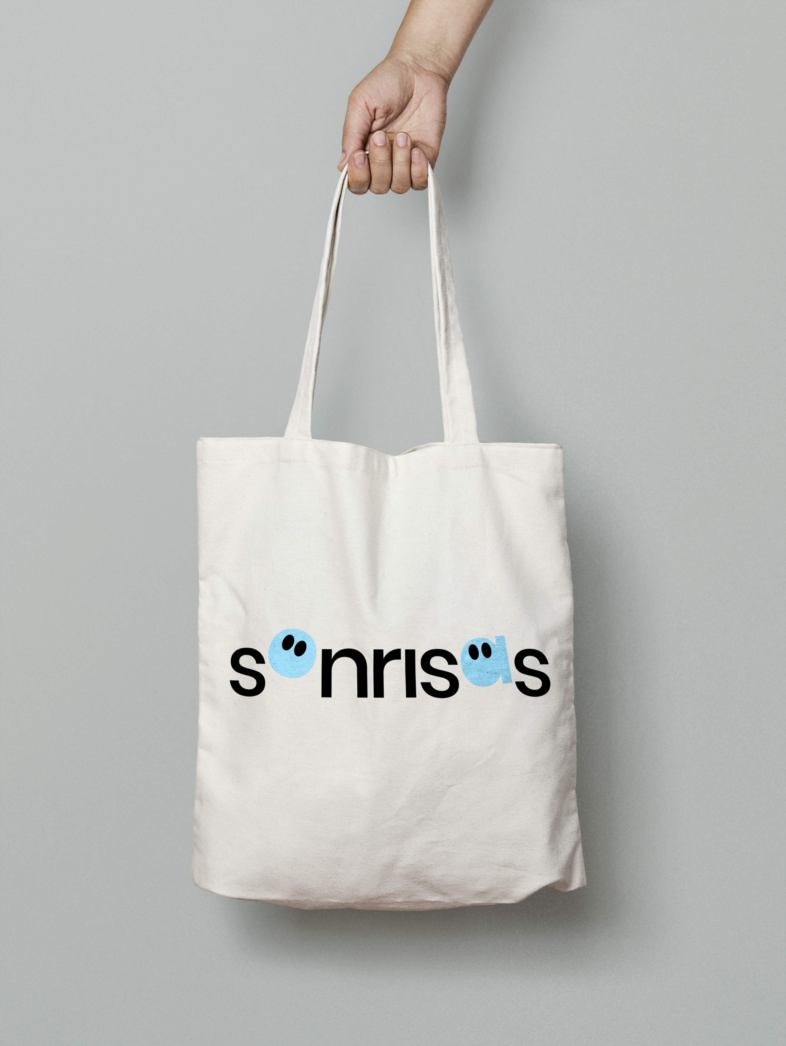
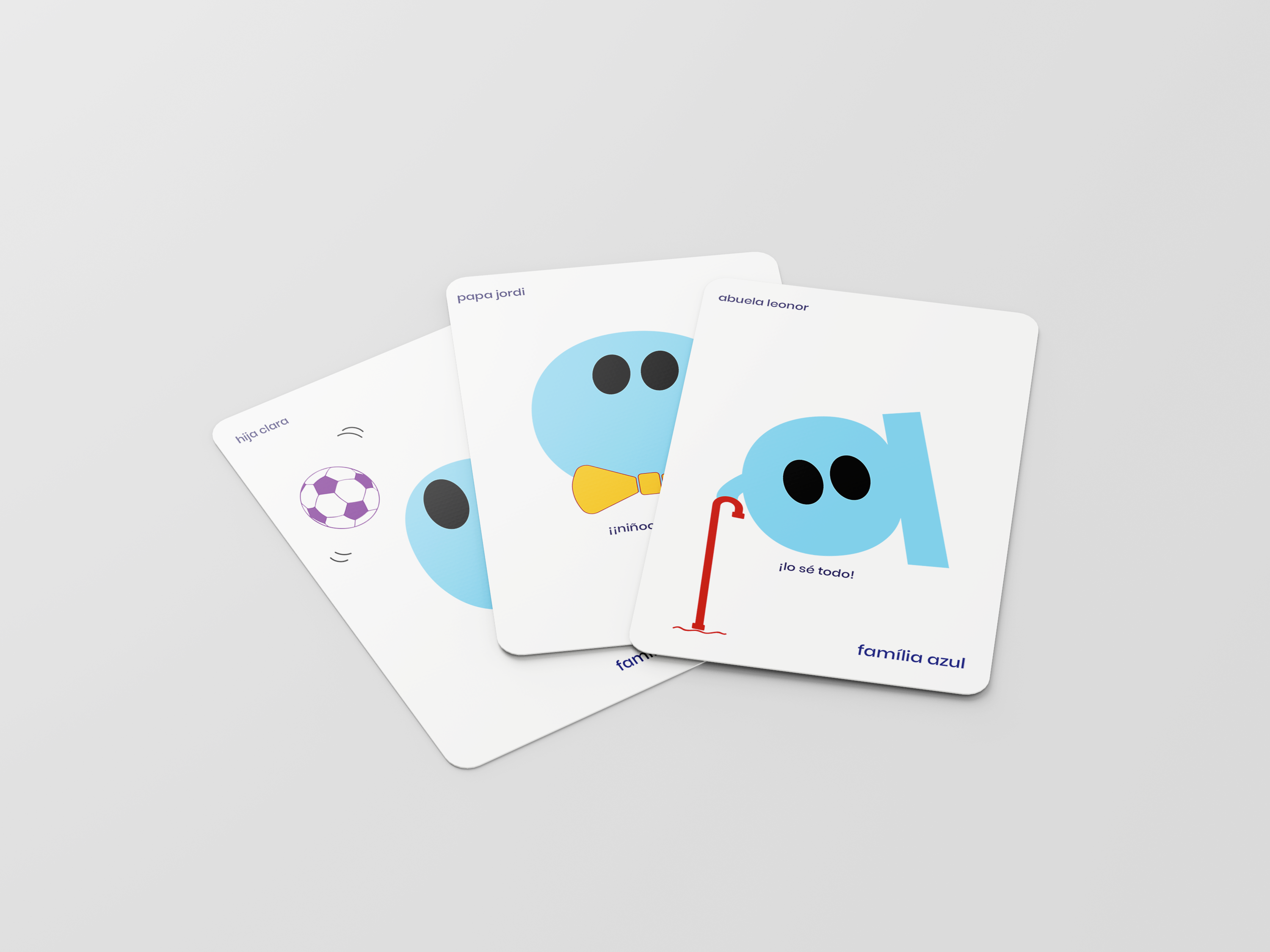
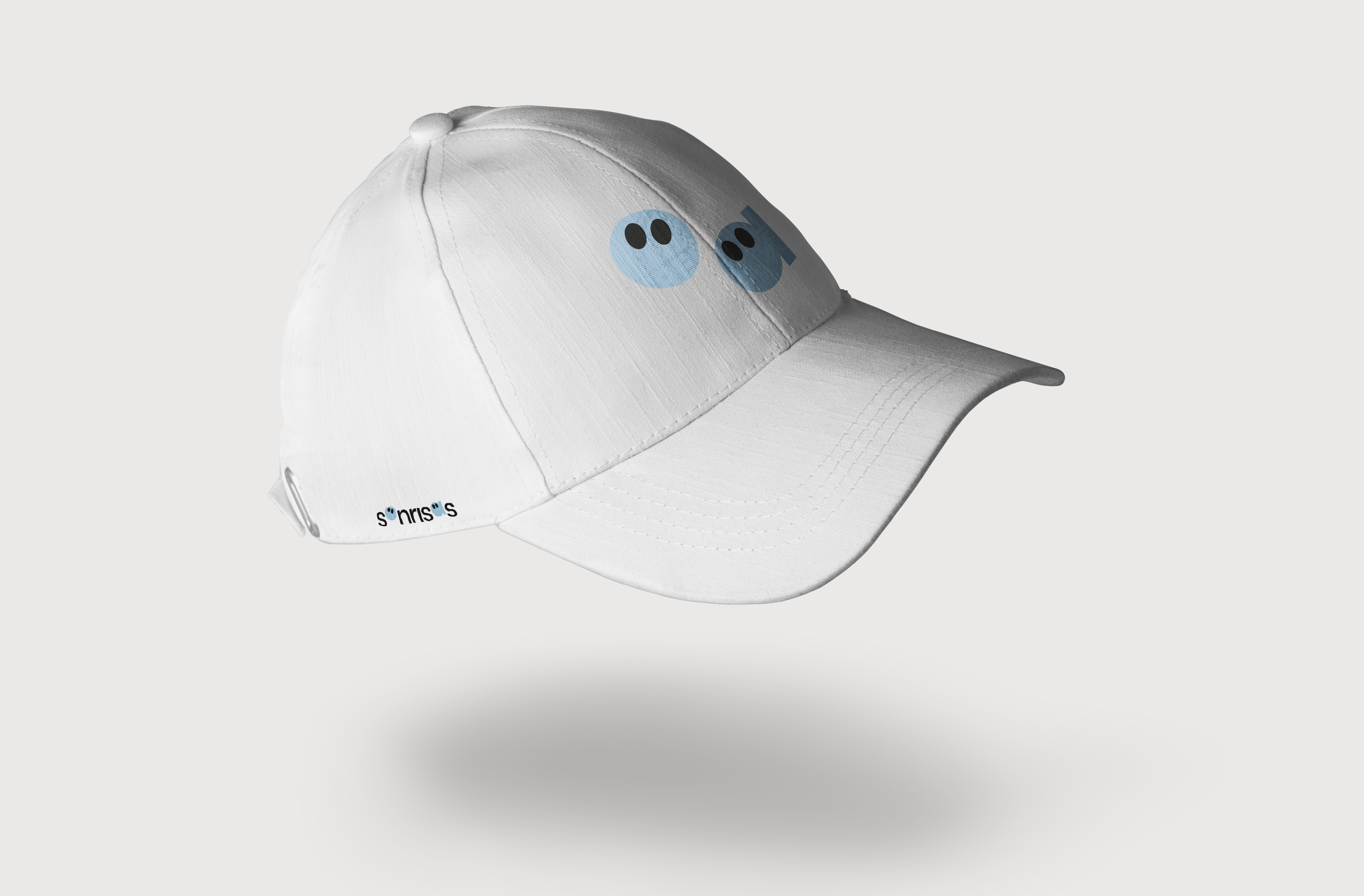
Sonrisas, Identitat d’una ONG.